Sunday 31 January 2010

23/11/09 | Industrialisation to the Industrialisation of War

This was the period of technology and steel construction.

1. Peter Behrens | AEG Turbine Hall 1910


He designed the image of the Turbine Hall, such as the logo, architecture and graphics. He is considered to be the first industrial designer. He worked with up and coming students such as Mies van der Rohe and Walter Grupius and Le Corbusier. The building portrays a sense of a monumental industrial structure but as seen in the sections there is a light and delicate quality to parts of the interior such as light steel elements of construction.

2. Gropius and Meyer | Fagus Werk 1913


This was the ‘first modernist’ building. The design expressed new qualities and structural possibilities of using new materials. It was the first building to use canter levers and to have a flat roof. One of the flanks of he building is all glass, and one of the first for this complete glass façade. This shows that construction methods were continuously changing and becoming more and more developed, a glass wall on such a large building is very substantial, and it allowed the interior to be flooded with light.

When the First World War happened things started to change. There was a celebration of the aircraft and the machine, which was later seen as an influence in design. The industrialisation of the War period changed the landscape completely, lives were changed and so did design and architecture. After the war the effect was noticeable in the big cities, people were injured and places were destroyed. The design changed due to the difficulty of construction, which had to stop, whereas in comparison, the artists were not affected as much.

3. Malevich | Black Square | painting 1919.


Malevich was part of the constructivism and Suprimatism period, which was an artistic and architectural movement from 1919. It favored art as a practice directed towards social purposes. It was a milestone in the history of art and design. Black Square is a simple geometric form of abstraction. The square sybolises a ‘full void’ to Malevich and shows hat the painting can perform itself. He does not use any representation but focuses clearly on the clean geometric forms. Malevich believed every object has a static faced as well as an inner dynamic and here with Black Square he is very clever with his painting. It can be read in two was, is it a black square on a white background or a black hole surrounded by a white frame.


1. http://pds.exblog.jp/pds/1/200701/05/88/f0126688_12503749.jpg
2. http://einestages.spiegel.de/hund-images/2008/05/16/47/1e3b3583d118090624a9a430f13f329a_image_document_large_featured_borderless.jpg
3. http://static.royalacademy.org.uk/images/width525/malevich-1491.jpg

Thursday 28 January 2010

16/11/09 | 1905-1910 Ornament and Crime

Vienna Secession

The Vienna Secession was formed by a group of artists about their rethinking in collaborative work in art and design. It included architects, painters and sculptors. The goal of the Secession was to provide exhibitions for young artists , to bring artists work to Vienna and to publish its own magazine to show members work.
The meetings were held in the Secession building built by Joseph Maria Olbrich, a statement building for the movement. It was a monumental presentation through the use of architecture, sculptural elements and decorative ideas.
1. Joseph Maria Olbrich | Secession building 1897
Gustav Klimt was a painter and one of the most prominent individuals of the Vienna Secession. He completed paintings for the secession, which were seen as pornographic and inappropriate. He also made portraits of wealthy women.
Egon Schiele, an artist was also in the group. In his self-portrait he brakes down the figurative representation. There is an abstractness to his work which overlaps with the architecture at the time.

Chicago Oak Park - Frank Lloyd Wright
Frank Lloyd Wright built a lot of houses in Oak Park, Chicago including his own.
Frank Lloyd Wright | Unity Temple 1960


The Unity Temple, 1960, was built there and people were convinced to think of a new church form rather than the traditional before. The church design was more considered internally than the exterior. Inside the interior it is very geometric with a triple height congregation space. It is still in use today. The exterior of the church is quite harsh, but still holds a sense of beauty to it even though it is mainly concrete. There is a threshold between the interior and the exterior of smaller spaces. As your walk through from the outside you are twisted from an open space to a smaller intimate space and contrasted to an open space inside the main body of the church.
I am interested in how Frank Lyod Wright plays with the scale of the space, from the exterior to the interior of the church. He is playing with peoples perceptions, which are surprised when led into a large open volume with a triple height interior. It is very monumental. Looking at the sense of scale it is interesting to see if this strong contrast in scale could be related to what I am currently working on with the Cienam Museum in Kennington. There are many small rooms within the site and one large open Hall upstairs which is a complete surprise to the building. I have been looking at opening up the spaces but creating smaller, more intimate thresholds from one room to another space could be effective and really work with the light projections, as well as looking at the programme of the cinema experience. You move through from one room to the next, sometimes from a small foyer to a large cinema auditorium and sometimes the opposite. Playing with the height of the room as well as the square footage reacts with the people and creates a completely different feeling.

Frank Lloyd Wright | Robie House 1908

This house consisted of cantilevered roofs and spaces. He brought a new aesthetic to American domestic architecture by using horizontal planes. The interior related to the horizontal lines outside which is an important aspect to the house. The horizontal mortar for the bricks is darker than the vertical mortar, which is a similar colour to the bricks. This emphasised the horizontal forms of the building. This detailing is very inspiring and really influences the aesthetics of the design. It is clear that horizontals are important. It seems simple but it looks beautiful.

Vienna – Adolf Loos

Loos was working on small projects at the end of the secession movement, such as shop fronts and single rooms.
Adolf Loos | Villa Karma | Geneva 1906


This set a marker for his design language. He used an existing building to wrap a new form around it. The composition of the piece is cubic and he challenges the decorative ideas. Was it was the right way to move forward? At the time, the house was seen as too simple and even ‘ugly’. It was very fresh in design and the residents were not keen. The exterior is a white box but the interior contrasts with an abrupt language. The entrance is round and 2 stories high, very unusual. Simplicity in the design allowed the material to speak for itself, the ornamentation and decoration is reduced; this was a key feature. Every room in the house was distinguished by its materiality and lighting.

Adolf Loos | Interior of Villa Karma, circular balcony above the entrance


Adolf Loos | Kartner American Bar 1907

This bar was very bespoke in design. There was a structure and ordering of space and amazingly it still looks the same today as when it was built. The materials used are elegant and the detailing gives a rich look to the design. Mirrors cover the two opposing walls in front of and behind the bar giving an infinity feel of space above.
To me, the design looks so rich and quite grand. The space is fairly small and so the mirrors help to show a larger room. The mirrors an opposing walls and t the top are really effective and make the columns look for ever lasting. Using mirrors can be tricky in design but they can also look very effective, which could be brought onto my site in some way to bounce light from on place to the other.


Image References
1. http://www.secession.at/building/images/olbrich.gif
2. http://unitytemple-utrf.org/images/graphic_building.jpg
3. http://forum.arts-crafts.com/groupee_files/attachments/9/3/7/9371038772/9371038772_robieHousepic1.jpg?ts=4B7364FB&key=0A7E72495E04308A585E625E1961309A&referrer=http%3A%2F%2Fforum.arts-crafts.com%2Feve%2Fforums%2Fa%2Fga%2Ful%2F1471038772%2Finlineimg%2FY%2FrobieHousepic1.jpg
4. https://blogger.googleusercontent.com/img/b/R29vZ2xl/AVvXsEgLlHefeN2ObqMfP49B58OXr8BGefCJRjEVVc09eyVBrT0YtmA3qXDTj5IL3ivPi9nVS0Vrt_YTo4hdtP157LzKEXlVnPbn7WJjYbbmu9Iq96D5QbOOYpTV6toO2pkWdPy4UT-YpwWx0aXg/s400/side+facade.jpg
5. http://www.anneke.net/Loos/i/circrail.JPG
6. http://spsu.edu/architecture/classes/3113-Rizzuto/Precept1/AmericanBar/bar2.JPG

Wednesday 27 January 2010

09/11/09 | 1900-1910 Art Nouveau

‘The terrifying and edible beauty of Art Nouveau architecture.’
Salvador Dali

Art Nouveau flourished in Europe and the USA until 1914 and was particularly prominent in Paris, Glasgow, Barcelona, Vienna and Berlin. It consisted of asymmetrical compositions, foliage, roots and stems with sensuous flowing lines. It evolved from the late Gothic patterns and consisted of a mixture of craftsmanship and industrial production; this created questions about Art Nouveau. What is this new machine aesthetic? How can it change and transform architecture and design?
In Paris, Hector Guimard designed the metro station street entrances. He was part of the new industrial trend with art and design, which he wanted to portray on a large scale. The entrances were based on Viollet-le-Duc’s structures, very ornamental and decorative.
Gaudi is very well known for his work in Barcelona; he was very expressive in his design, especially with Casa Batllo, 1877-1905. The house is very prominent in comparison to the other buildings around. It is described as the ‘House of Bones’ and is obvious why. Gaudi’s level of detailing is astonishing, such as for the connections in materials. The sculptural pieces are influenced by skeletons and organic forms where he wanted rid of all orthogonal lines, as they created the wrong impression. The roof design is based on a representation of a cross stabbed in a dragons back, the detailing on the roof is amazing, and the material of broken ceramic tiles is beautiful and very colourful. Gaudi has used a narrative to design the building and it has definitely made an impression on people.
This building has grown on me every time I look at it. It looks very overpowering, but I really like how Gaudi has chosen a subject and really took it to extreme levels in his work. Skeletons influenced his work and so he designed every single piece on the façed to portray this inspiration, the balconies look like skulls. I think I can take this way of working into my studies, to be more extreme with my designs and not be afraid to go for it. He has clearly loved the Casa Batllo project, which is simply shown by his extreme levels of detailing and thought. This can definitely help me in my design, it may be a risk but it certainly looks worth it.
In Glasgow, Charles Rennie Mackintosh was influenced with Japanese prints and simple design. He used a new curved geometry in his work and changed interior design. Decorative aspects used to be part of the interior decoration, but it became 3D design, it was starting to have a physical presence. The abstract curves provide an energy and growth to the designs. Everything became part of the design, text, frames, railings to name, all became important to the designer. Nature was a big influence, and was represented in an abstract way, especially seen by Mackintosh.
Charles Rennie Mackintoshes way of working was quite different to others. He got to really know his clients before designing, observing them for a few weeks, sketching and taking notes. This helped him engage with the clients are really create something to their personal needs, he believed function was very important and that the beauty would follow, which it always did with his work.
Hill House, 1902-3 shows a huge contrast between the external (castle like and quite dense) and interior forms (pure and gentle). Mackintosh chose a white plaster finish with red tiled roof; a feel of masculinity compared to the interior, which seemed more feminine and delicate. He used a monochrome palette very effectively; this is carried throughout the whole house, which is also echoed in his furniture designs, such as the high back chairs. Everything in the design had been thought of meticulously and it definitely showed. Mies van der Rohe called Mackintosh a ‘purifier’ in his work, which is clearly seen here in his Hill House.
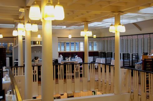
Other pieces Mackintosh design were the Willow Tea Rooms, 1903 also in Glasgow.The design was simple; the main source of the Tea Rooms was the chairs and how they defined the room. The furniture was used as architectural pieces. In his apartment the chairs were also a very prominent part in the design, his dining room was influenced by Japanese design.
I am really inspired by Mackintoshes simplicity in design. The geometry is beautiful.By using monochrome in the Hill Hosue and even in The Willow Tea Rooms, it really allows the simple design to take place, especially as the furniture is part of the architecture. The clean lines are easy to read and very attractive.
1. C. R Mackintosh | Willow Tea Rooms,
In Brussels there was money and so many people were applying the Art Nouveau experience to their private homes; this became a framework for a new mid class, not present before.

Victor Horta | Tassell House 1894

Victor Horta designed the Tassell House in 1894. He used steel and stone together to explore the new industrial materials, a quintessential piece of art nouveau. The house creates a real sense of fluidity in the geometry of the design. There is a constant feel of movement, which is expressed through every part of the design, the railings, the stairs, the floor and even the design on the wall. It is strong and feels like it will engulf you as you walk up the stairs. This sense of power depicted by a piece of architecture is amazing, thinking about how to engage someone with the design presence in the room. Creating more powerful pieces to really take over the visitor’s senses or feeling would be very effective.
His house and studio was a take on the traditional Brussels house with art nouveau elements in the design. He used it to sell his work, like a show house. He designed with steel, which he cut away to expand the light and there is a contrast relationship with the recess and protruding elements. The entrance is a huge statement for how the experience will be, but even before entering the house there is already so much detail, in the exterior, beautifully flowing balconies and door handles are a taste of what is to come. This is definitely inspiring for me, in my project at the moment I am looking at how I can transform the exterior site as well as the interior site to make it more appealing and attractive for the visitors, by looking at small details it can really make a difference. The building on my site is quite a statement in itself and se thinking of new ways to regenerate the exterior for the 21st century is quite challenging.
2. Decorative detail for the lock on Hortas House

Image reference
1. http://i172.photobucket.com/albums/w25/TullyHs/RennieTeaRoomsreduced.jpg
2. http://www.bluffton.edu/~sullivanm/belgium/brussels/hortahouse/0019.jpg

Tuesday 26 January 2010

02/11/09 | Introduction

Many architects and designers have made a huge impact on how we see architecture today.  Aesthetically, structurally, externally and internally.  Many design movements have occurred since 190, each with their distinctive identities and qualities.

The arts and crafts movement from 1880 - 1910 was partly initiated by William Morris. The movement expressed simple forms using true craftsmanship and skill with traditional ideas and materials.  For example handcrafted wooden window frames and traditional brickwork.  At the time the Victorian era of architecture was still present but consisted of many styles.  The Arts and Crafts were a side step form the industrial design and gothic influenced pieces creating a new idea inspiring decorative arts, domestic design and architecture.

I like the Arts and Crafts movement as it consists of more traditional methods and ideas.  Some quite beautiful pieces have been designed and made with obvious care and attention.  Although simple forms were generally used, the detail in the design is quite beautiful.

Throughout history, the development in design has increased significantly.  Construction methods have developed in particular, Le Corbusier designed the Domino effect allowing architects to design new styles of building and aesthetics.  Frank Llyod Wright integrated new technology using steel to cover large planes, instead of bricks and plaster.  He also used open plain glass which can be seen in lots of architecture today.

The program for the term looks very interesting and I am looking forward to looking at various movements, architects and buildings some of which I have learnt about before and some I don't know much about.  It is always helpful to look at the relationship in work throughout history and the effects it had at the time and how it does today.  Robert Venturi's Post Modern house he designed for his mother in 1961 had a very symmetrical exterior, although often distorted.  Venturi had a 'cut and paste' attitude to his work and mixed his ideas with the influences and design aspects from the past, such as the Porta Pia by Michaelangelo and Luigi Moretti's apartment, both in Rome.