Mies van der Rohe changed people’s perception of construction, how to use materials and piece them together in different ways. He pushed the technology and materials to the limit; he stripped everything down that wasn’t needed in the design, they were simple which help emphasise the important detailing in his pieces of architecture. He designed his first house when he was only 20 years old.
Mies van der Rohe’s architectural career started in 1908 when he was an apprentice for Peter Behrens. He worked alongside Walter Gropius and Le Corbusier concerning the current design theories at the time. In Mies’s early work many people thought it was too fictional for the time with elements such as steel geometry and large glass pieces. It is interesting to see that Mies worked mainly in plan on paper. His work features classical influences, and focuses on clean and pure elements.
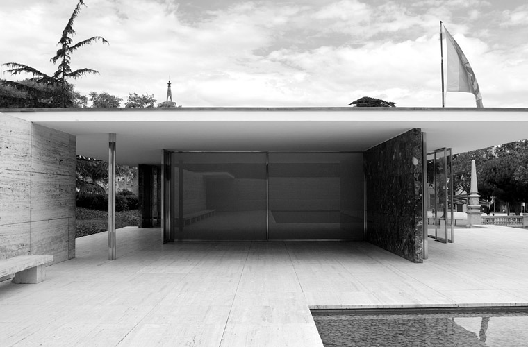
1. Mies van der Rohe | The Barcelona Pavilion 1929
It was originally a temporary structure to last 9 months. It was a minimalist masterpiece and featured on the front cover of ‘Architecture’ in the 20th century. The Pavilion was recorded with photos and drawings and 50-60 years later the pavilion was reconstructed; it was seen as a huge influence in architecture and design and became a copy of itself.
Originally Mies was asked to design furniture and walls for the interior of the industrial space of the exhibition, but he changed the brief he was given considerably and argued for a space to build a pavilion instead, which was on the edge of the exhibition site. The design and construction happened in less than one year.
The Pavilion is minimal and he designed using plan and perspective. The design consists of a strong horizontal symmetry, a contrast to the vertical symmetry seen in classical architecture he was influenced by. The use of horizontal planes breaks the space into different areas; Mies was playing with different lengths, proportions, planes and arrangements in the spatial layout. Parts of the design would disappear from certain view points due to the positioning of the walls and also the delicate nature of parts of the design.
From his preliminary sketches it can be seen that his design did not change too drastically. They show open spaces, orthogonal plains, overlapping elements and framing in the design. Mies was obsessed with detailing and experimented with materials; each part was made out of something different. For example, he used many types of glass; clear, bottle green, mouse grey, sand blast and milky white, for stone he used onyx, alpine, travertine and Greek green stone. The columns designed are beautiful and simple in appearance. Mies was very particular with the detail of the pavilion and did not want any unnecessary pieces to be there. There were no doors, and so the entrance door had to be installed and removed each night. There were no light switches and the only source of light was produced by a light well, sunlight in the day and at the night the well was lit with artificial lighting, hidden away from the pavilion; this lit up the whole space.
2. Detailing of column
3. Materials in the pavilion
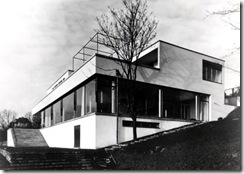
4. Mies van der Rohe | Tugendhat House 1930
In 1930 Mies designed the Tugendhat House in the Czech Republic. He was working on the Tugendhat House at the same time a family; there were many similar elements to the Barcelona Pavilion apart from the difference in the site. He used a similar structure with the cross form columns with long windowpanes. The site was on a slope; the house was designed in terrace levels mainly using plan and section. There was a hierarchy in the spatial arrangement. The top level housed the bedrooms and underneath the main floor was completely open and minimal. He used plan and section to design.
5. Front exterior of the house
The exterior of the biding is very deceiving when you approach the building. It is long and thin and you would not know the excitement behind. The entrance is a courtyard, framing the view of the landscape. The purity and open space in the house were so different to the houses at the time. Mies was very interested in materiality and detail as seen with the Barcelona Pavilion. The family were encouraged to buy an Onyx wall, which at the time cost the same as a middle class house. Everything in the house relates or has a relationship with each other, for example, the locks of the doors, the chair legs and the columns are all chrome and match.
He used Charcoal to sketch. They look really beautiful and are very easy to read. The simple lines portray so much. This is really inspiring for me and I would like to think about using a similar method o draw. I am looking at light and projection and so the contrast between the charcoal and the paper would work. The charcoal would be a good medium to use as it can help define a light beam and also help create a smoky atmosphere within a drawing.
His obsession with detail is amazing. He is so particular about every part to the design, this is great to see and learn about as it inspires me to think even more about the detailing and the reason behind each element of the design. The light well he used in the Barcelona Pavilion to light up the whole place is a good thought, during the night when it is dark, lighting up the light well with artificial lighting a very detailed thought allowing the space inside the pavilion to be free of any artificial lighting, which would then completely change the atmosphere and purity of the design. This is very interesting and has made me think differently to the lighting in my project. I don’t want to use any artificial ceiling or wall lights in my design so thinking of alternatives to the solution is important.
Image Reference
1. http://figure-ground.com/data/mies_pavilion/0013.jpg
2. http://www.srperrin.co.uk/Bacelona_Pavilion/Barcelona_Pavilion_Images/Barcelona_Pavilion_07.jpg
3. http://www.srperrin.co.uk/Bacelona_Pavilion/Barcelona_Pavilion_Images/Barcelona_Pavilion_09.jpg
4. http://lh6.ggpht.com/organonarchitecture/R58I4B2GHcI/AAAAAAAABaI/xQjV7IP19VI/tugendhat-CRTugen1930deSandalo_thumb
5. http://www.arquitectura.com/arquitectura/monografias/notas/casa_tugendhat/image024.jpg